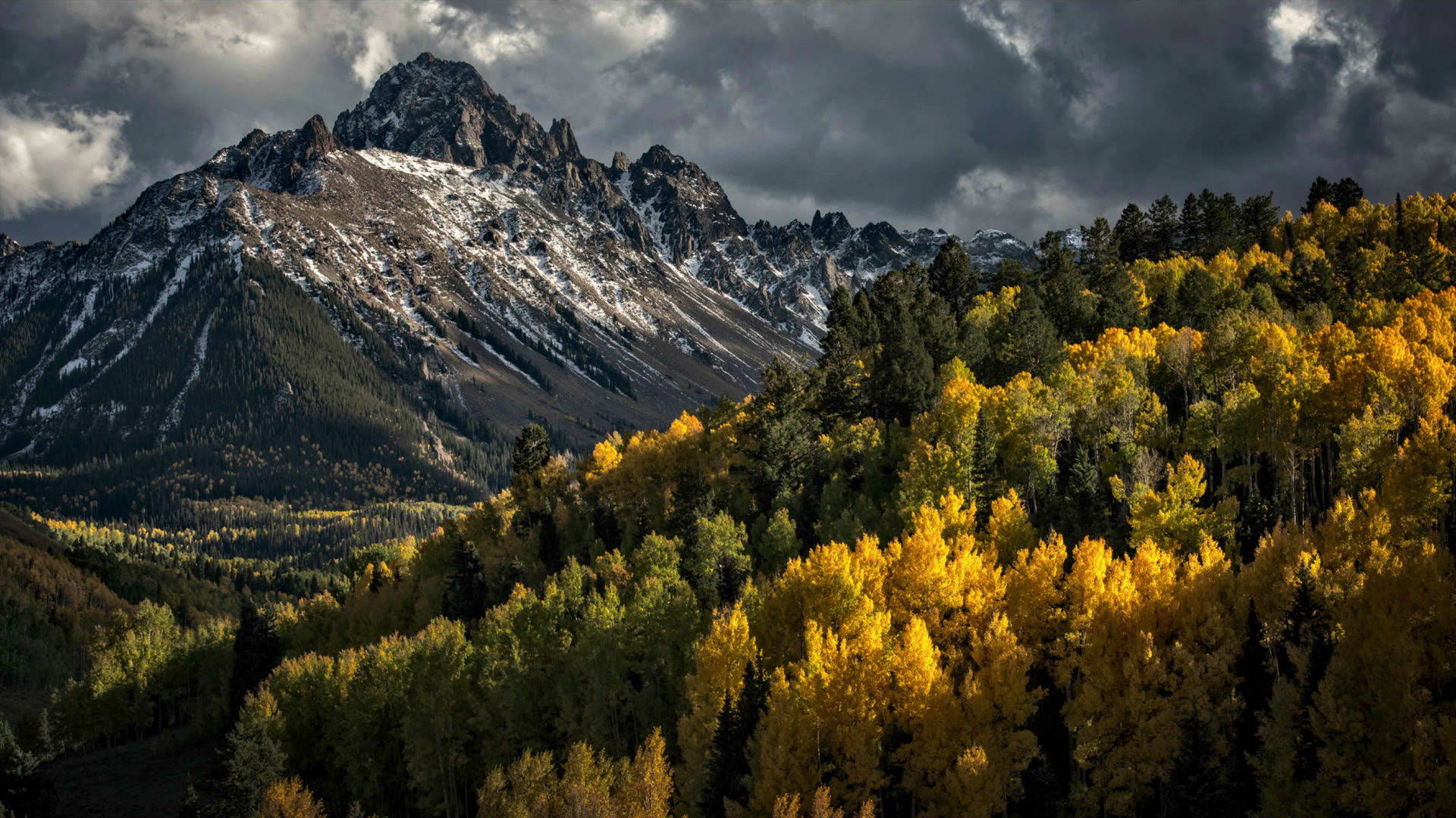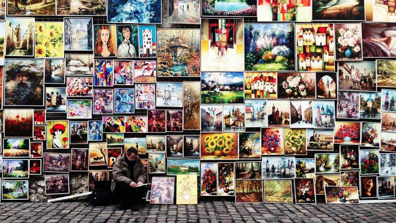
Visit most any photo site on the web, and the vast majority of images you'll see are of people, nature and architecture. These are the overarching topics that are then subdivided - people in foreign lands, formal portraiture, kids, etc. / landscapes, seascapes, wildlife, etc. / cityscapes, isolated iconic buildings, close ups of buildings and their reflections, etc. While the text and sample images of this article focus on landscapes, the same principles can be applied to most of the listed subjects above. So study the following hints and tips and think how you can substitute Subject A, B, or C into each.
It's All About the Light: The most dramatic light occurs at sunrise and sunset. The color is warm, it reveals shape and texture due to the low angle, and if there are clouds, the colors can be spectacular. While being out at sunset isn't much of a sacrifice, getting up at the crack of dawn can be a struggle. But if you don't, you'll miss some of the best light of the day.
Think Small: Landscapes are commonly photographed with wide angle lenses to take in the grand scenic. While this is an absolute requirement, don't overlook the intimate landscape that lies at your feet. Look to the right, to the left, and down. The shot of the day may be a macro just twelve inches from your big toe.
Filter it: Two filters I never leave home without are my polarizer and graduated neutral density. The polarizer saturates a blue sky and removes glare. Without it, my skies lack contrast and my colors aren't as rich and saturated. The graduated neutral density allows me to create a perfect exposure of a bright sky and shadowed foreground. A 2 stop soft edge is the most versatile, although I own many other variations.
Rule of Thirds: I prefer to call it the Guideline of Thirds in that there are times when you can break it successfully, but for the majority of photographic situations, it will help. Getting the main subject out of the center of the picture provides a better image. Note the key focal points in each of the three photos that accompany this article. None are bulls eyed.
Touch of Color: Take a look at the image made in Bryce Canyon. The tree stands out for three primary reasons - rule of thirds / different texture / different color. In what would have been a monochrome image, the tree is used as a color focal point. As it's so different from the rest of the subject matter, even though it takes up a small portion of the picture, it's the primary subject.
Wise Use of Depth Of Field: If you want foreground to background sharpness, strap on a wide angle, stop it down to f22 and focus one third ito the image. This works great for showing the vast landscape. On the other hand, if you want a single flower to be the focal point, do the opposite. Strap on the telephoto, focus on the given bud, and open the lens up. This will create a selective focus look wherein just a single plane is sharp leading the viewer to that spot.
Leading Lines: Leading lines bring the viewer to the primary focal point. They can be zig zag, bending, or diagonal, but should relate to the context of the overall image. In the coastal sunset shot, I used a wide angle and placed the lines of the flowing river and reflecting sun in the foreground. Note how they follow a bending path up to the shoreline and then to the seastack and sunset.
Most Recent Articles
There are no articles yet.
Random Articles

