Announcements
No announcements yet.

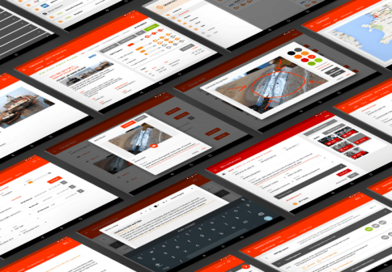
Are you designing at “Retina” resolution in Photoshop? If the answer is yes, then this article is for you. I will walk you through the problems I faced in creating Retina mockups to be displayed on a tablet device. I will then explain a way to work that is easier and gives you better performance. This is about my experience with Photoshop, but it could be applied to Illustrator and other software.
Now, let’s get into the design of this tablet application. Like many other designers, I had been told that one must design at Retina resolution. The general consensus is @2x or @3x. So, I set out on my merry way, designing @2x. The design would be presented on a Nexus 9 with a 4:3 ratio, so my Photoshop canvas was set up to 2048 × 1536 pixels. After creating a few screens, I realized in practice this doesn’t work well at all. Let’s work through the issues I found.
At first, this is no big deal. Zoom out to 50% or 33% to see your design at roughly 1:1. But at the same time, it’s a bit ridiculous, right? Why should you have to zoom in and out constantly to see what’s going on? It also completely ruins pixel-snapping, which works best at 100%. It’s almost impossible to know whether a pixel is aligned when you are zoomed at 33% or 50%! Suffice it to say, I got pretty fed up zooming in and out like a maniac to get things aligned pixel-perfectly.
Most Recent Articles
- Dec 9, 2014 A guide to the web directory Search Engine Friendliness by Administrator
- Oct 22, 2012 Learning How to Make Money Blogging by Administrator
- Sep 17, 2012 How to install Subrion CMS? by Administrator
Popular Articles

Giovanna Casotto is next to Ilona Staller(Cicciolina) one of Italy's most popular TV actrices, but she also is an comic art artist, already auteur...
3922 Views

This article is dedicated as a coaching guide to provide Internet users with information on the fast Internet broadband access available today and...
2746 Views

Front end web developers hold a great responsibility to craft pixel-perfect layouts that run properly in all web browsers. Over time this has...
1914 Views

There is no incentive for people to submit their web sites to the web directory, unless it is SEF directory. Why is that so? Really? How one can...
1754 Views

If you've never heard of VoIP, get ready to change the way you think about long-distance phone calls. VoIP, or Voice over Internet Protocol, is a...
1590 Views


